|
||||||||||||||
 |
||||||||||||||
 |
||||||||||||||
|
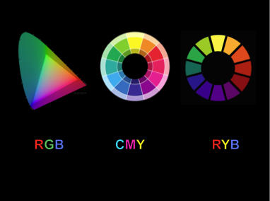
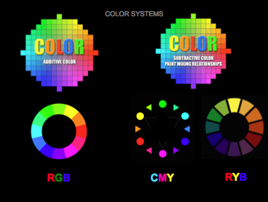
Paper delivered by Brian Curtis, Associate Professor, University of Miami, Coral Gables, Florida at the FATE Biennia Conference, Savannah, GA Thursday, April 4, 2013 for a panel titled "Color Wheel or Color Won't", Chaired by Andy Gambrell, Independent Artist, South Carolina and Martha Horvay, University of Nebraska, Lincoln, NE We have assembled this morning to discuss whether or not it is in our students’ best interest to restructure basic instruction in color theory so that it privileges the additive RGB mixtures used in computer screens or the subtractive CMYK mixtures used in digital printing technology over the subtractive pigment mixtures of the more traditional color system represented in Newton’s RYB color wheel.
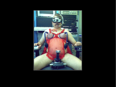
But before offering my position on the proposed restructuring I would like to start out by addressing the elephant in the room; the fact that the lofty goals that have been the bedrock of higher education throughout much of human history are being summarily dismantled by a wave of techno-utopian hucksterism that privileges utilitarian values of speed and unlimited information access over the pursuit of critical thinking skills, knowledge development, and aesthetic sensitivity and that this disruptive influence continues to expand uncontested despite a growing body of empirical evidence that demonstrates that reliance on a computer and the Internet as learning tools makes the user measurably less intelligent and inhibits his emotional development.
Empirical research has confirmed what most of us have observed. Computer usage damages the user’s capacity for concentration, contemplation, and reflection, compromises the way he reads, diminishes his comprehension, disembodies his relationship with the world, de-emphasizes interpersonal relationships, and weakens his memory. That is worth repeating. Computer usage damages the user’s capacity for concentration, contemplation, and reflection, compromises the way she reads, diminishes her comprehension, disembodies her relationship with the world, de-emphasizes interpersonal relationships, and weakens her memory. That is quite the ‘witch’s brew’.
And you can add to that witch’s brew the fact that computer usage is debilitatingly addictive. Computers are designed to trigger the innate pleasure we are hard wired to crave from the anticipated stimulation. That is the appeal of 24/7 connectedness. This means that we are evolutionarily programmed to enjoy being distracted. We have already seen how our innate craving for sweets, salt, and fats has contributed to an epidemic of obesity in the US and the compulsion to stay digitally connected reveals computers to be the equivalent of ‘Twinkies’ for the brain. They provide pleasure while they diminish our intelligence. To increase their popularity software and the Internet are constantly being upgraded to provide faster and easier access to ‘anticipated stimulation.’ And as the computers get smarter we get dumber. The result is a ‘technology of distraction’ that demonstrably interferes with the brain’s ability to form the associative neural links that constitute the mental capacity we call intelligence. The result is that our minds are being consumed by a medium. All technology has unanticipated downsides and the downside of digital technology appears far more serious than popular culture is willing to admit
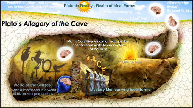
But higher education is not listening. In fact, the current wave of digital euphoria simply reinforces an existing educational bias that privileges a disembodied reality because it feeds off of abstracted left-hemisphere analytical thinking at the expense of intuitive right hemispheric perceptual experience. While admittedly this marginalization of the perceptual has roots dating back to Plato’s idealism the current fascination with technology amplifies the antagonism between visual and verbal forms of knowledge to the point of absurdity thereby forcing art departments to abandon the one-hundred thousand year understanding that non-verbal communication is the foundational platform for making sense of human experience. (Denis Dutton, The Art Instinct,)
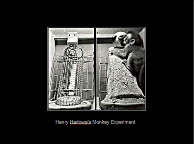
However, interacting with the physical world is essential to learning. Touch has long been understood as a major component of what makes us human. In the 1950’s the psychologist Harry Harlow reinforced the importance of touch in an experiment where he put two surrogate simian “mothers”, one a wire frame “surrogate” with an attached milk bottle and the other a wooden ‘mother’ covered in terrycloth without a milk bottle, in a cage with an infant monkey. The infant monkeys clung desperately onto the terrycloth ‘mothers’ for hours, ignoring the desire for food in exchange for the softness of the terry cloth. In another experiment the comforting softness of the terrycloth ‘mother’ was removed leaving only the wire mesh surrogate with the bottle. In this situation all test subjects experienced developmental and behavioral abnormalities. Recent reports of severe emotional problems of children adopted from Eastern European orphanages where the orphans are deprived of nurturing physical contact reinforces Harlow’s conclusion that humans need touch to maximize their potential.
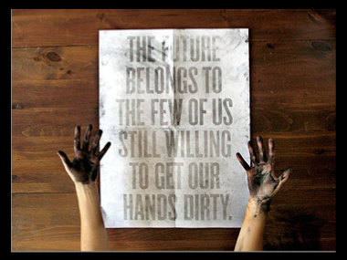
Manual skill acquisition and the pursuit of quality help define our humanness. When applied to art such training requires us to look deliberately, look intensely, seek meaning in a complete awareness of and participation in the physical world. This pedagogical model springs from an innate human predisposition traceable to the Pleistocene era to value objects that require specialized skill in their making, that provide direct sensory pleasure, that require a decoupling from practical concerns, logic, and rational understanding, and that acknowledge their place in the longstanding traditions of art. The alternative to the de-humanizing trend in our conceptually oriented, digitally dominated learning environments is to actively promote the value of hands-on training in traditional media. Touch is the well from which empathy, sensitivity, and artistic intuition are drawn. Taking care on a project and doing one's best provides the means to heighten and make more significant personal and collective experience. Developing intuitive understanding through concentrated manual tasks can’t be downloaded it can only be lived. Making is thinking. Students need to work with their hands.
Having addressed the negative consequences that accompany digital technology allow me to turn to the question of whether the ubiquity of digital screens and digital printers in our departments should alter the way color theory is presented. As I am sure you have already surmised, I believe the proposals for our session are shortsighted. It makes no sense to replace Newton’s color wheel as the premier learning tool of color pedagogy.
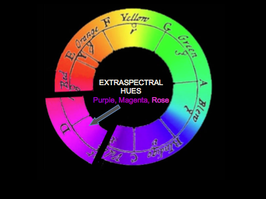
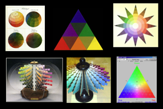
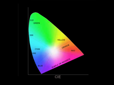
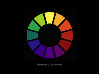
I hold this position because the color space that Newton created by adding the non-spectral red-violet hues to the spectral hues so they could be arranged in a unified circular progression of incremental hues is far more effective for unlocking the fundamental elements of color theory than any of the other color space representations from which we can choose (Goethe, Runge, Chevreul, Munsell, Ostwald, Maxwell, Itten, Albers, Pantone, Gamblin, CIE, HSV, HSL, or CMYK). I rest my argument on the graphic simplicity and conceptual clarity that makes Newton’s wheel so indispensable and as those of you who introduce color to you students already know, clarity and simplicity are not characteristics that easily attach to any of the other color spaces.
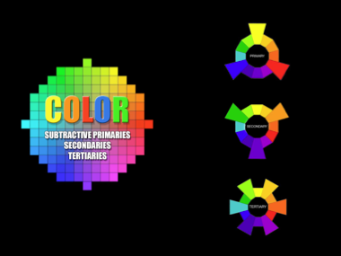
Let us take a brief look at why Newton’s Subtractive wheel is unmatched in its functionality as a visual tool. Clear and straightforward geometric organization is the key. The equilateral triangular organization of the subtractive primaries, secondaries, and tertiaries, along with the clarity of the multiple quadratic rectilinear relationships within the wheel provide an easily digestible and fully comprehensible introduction to essential color terminology.
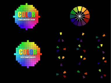
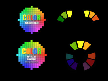
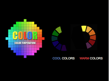
The graphic geometric organization continues with the simplicity of the linear opposition of the complementary colors and split complements is introduced. Circling any three consecutive hues on Newton’s wheel that can include but must lie to one side of a primary defines analogous color and halving the wheel from the left of yellow to the right of violet is an effective way to introduce a preliminary discussion of color temperature.
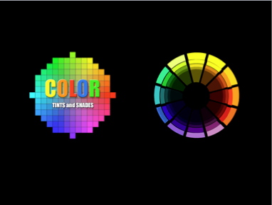
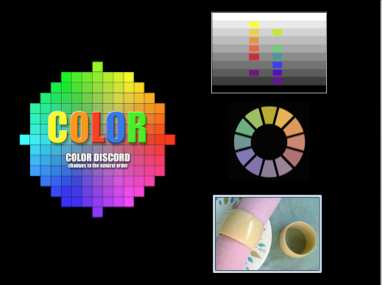
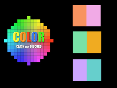
The basic Newton color wheel can easily address value in color by expanding each hue to include tints and shades radiating out of the center of the wheel. Once tint and shade are introduced Newton’s wheel becomes ideal for presenting the concept of color dischord. This occurs when the natural order of value in color combinations is altered so that naturally dark colors are made to appear the same or lighter than those that are naturally lighter (higher) in value.
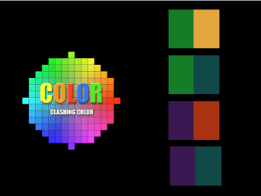
Clash can also be effectively presented using Newton’s wheel because visual color tension arises when two colors (ideally a secondary and a tertiary or two secondaries) on opposite sides of a nearby primary are juxtaposed.
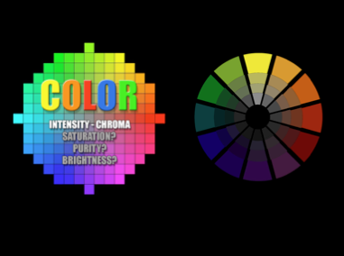
To introduce the concept of color intensity (saturation, purity) the circle again provides an effective template where the full strength colors on the outside edge of Newton’s color wheel are gradually reduced in multiple steps toward gray at the center. Newton’s Color Wheel does it all and does so simply and effectively.
As I have just demonstrated, the entirety of color theory is visually present in Newton’s brilliantly simple design. Newton’s wheel is unmatched in its compactness and clarity. It is so straightforward that Newton’s wheel can be visualized in less than a minute with nothing more than a piece of scrap paper and a ballpoint pen anytime a student needs a refresher in color theory relationships. The same cannot be said for any other color space. |
||||||||||||||
| PRESENTATION INDEX | SITE INDEX | |||||||||||||
| email: brian_curtis@mac.com | ||||||||||||||
| University of Miami Faculty Webpage | ||||||||||||||